I had an epiphany of sorts lately after viewing the following video from TED. Simon Sinek gave a talk about how great leaders inspire action and gave three powerful examples. Like most thing I hear I asked myself “How does this apply to BI?” and for me it turned on a light bulb.
Watch this video, it’s 18 minutes well spent.
Applying this Concept to Business Intelligence
Most BI Professionals talk about the latest technology, emerging trends, software, star schema designs, delivery methods, mobile BI, “big data”, in-memory, etc… the list goes on and on, but in my 15 years I’ve never heard a BI professional explain WHY they work in the “BI Space”! Most everyone works for a paycheck, but that old adage of “Do what you love, and the money will follow”… how many BI practitioners fall in to that bucket? My guess would be more than most when it comes to technical jobs, but I would also guess that most have never given any thought about why. What we do is hard, there is not getting around it, so there has to be a level of passion for data and analysis that comes with the job. I will admit it, until watching this video I didn’t give it any thought, but I was able to answer the question very easily.
Why do I do it?
“I work to enable better business decision by leveraging what already is known against things that are not known. Through this process I attempt to provide insight in to the company’s inner workings and make those who use the data more successful and productive.”
How do I do it?
“By leveraging best practice methodologies, and applying it within the reality that is the business environment realizing that those two don’t always align”
What do I do?
“I build data warehouses and business intelligence solutions that meet business requirements”
If we approached the business users from this inside-out approach to “sell” them BI, what do you think the result would be? I think this method has potential to improve user adoption rates, improve the requirements process, and contribute to the overall success of BI projects. Am I a dreamer? Probably, but it makes perfect sense! If someone came to me selling the Why rather than the What I think I would be much more engaged in what was going on… we have to get the business to believe what we believe, not buy what we are selling.
If you are reading this, sit down and figure out why you do BI… what do you believe? Then take the next step and rather than selling the what to the business, try to sell the why!
]]>It’s scary to think about the dollars involved, but with over 70% of Business Intelligence and Data Warehousing projects failing it is surprising to me that more research hasn’t been done it to WHY these projects are dying on the vine. I suppose that in the end, it is just a lot of finger-pointing and bad feelings but I would attribute it with two overarching reasons:
IT developing without business sponsorship or involvement
The business failing to adopt the BI solution once the work is done.
Now the first one bothers me but most IT shops learn from their mistakes and while they didn’t have time to do it right (i.e. work with the business) the you have time to do it over. The second one baffles me, especially if the business has been involved from day one through delivery including the selection of the tools that will be used. Once IT delivers what the business wanted, they don’t use it and the continue to rely on the old way that they always got their numbers before BI was available.
If it Ain’t Broke Don’t Fix It
Many users will profess that they are fine doing things the way they have always done them, and just because the executives went out and had a BI solution developed doesn’t mean they have to use it, right? Wrong. While the BI solution may meet the needs to do your day-to-day duties, it’s the analytical power and time savings (hopefully) that will free the user to not only “do their job” but extend themselves to find ways to drive the business forward.
I get it, no one likes change, but the executive team has to help sell BI to their internal teams to help foster adoption of this new way of doing things. The user’s are right, it might not have been broke, and it didn’t need fixing, but there is always room for improvement.
It’s Too Hard! I Can’t Learn How to Do This!
Admittedly, some BI tools can be a challenge to master, and some have a steeper learning curve than others, but executives and IT must work together to train the users to use the tools. Before you choose a tool, did you involve the day-to-day users in the evaluation process? Did you invite them to a demonstration so see their reaction to the tool in use? If not, that may have been your first point of failure. If the user community feel like they had input on the tool selection, they may be more likely to have an open mind in learning and using the tool because it’s the one “they picked”. Involve the users early and often and adoption and usage rates will rise.
Training can also raise issues with adoption as you have to remember that everyone learns at different paces, with different educational styles. Auditory learners aren’t going to do will with a written manual and kinetic learners are going to get anything out of a lunch and learn unless there are opportunities to get their hands “dirty”. You have to have multiple avenues and styles of training available or you will miss a percentage of your audience every time.
Exposing the Truth, I Think…
The last point might not have anything to do with the BI solution itself, but more with the users and their lack of intimacy with the data. Some people know what they need to see on a report…
“Variance X is within 3% of the budget so I don’t have to worry about it this month…”
Intimate usage of the data involves searching for what might not be visible to the casual user, and because of a lack of deep understanding of the data, there may be a fear of being exposed for not knowing the ins-and-outs of the data like they are suppose to… so if they resist BI, the problem might go away.
This may be harsh, but with the amount of data being produce and reporting today, users can’t function like this anymore, and it may be time to find new analysts.
In the End, You Just Have to Push
Like I said earlier, no one LIKES change, but most people will ACCEPT change if pushed. Some companies fail to take away the “old way of doing things”, but if your BI solution is supposed to replace the old way, then shut down the old system, or at least deny access to it so that users are forced to make a change.
]]>Myth #1: General IT workers know how to “do” business intelligence.
Many IT shops try to retrofit a BI team out of people who appear to have some of the skills that you see listed in a Monster.com job opening for a BI professional. This is a recipe for failure as a general IT worker might be able to deliver a report to a user, but without proper data modeling skills, ETL knowledge, and OLAP cubing skills what will be delivered is what I like to call “Fake BI”. Fake BI can answer one or two business questions, but the minute the business wants to slice the data a different way Fake BI is exposed as incomplete. This is not to say that general IT workers can learn BI, but they need to be mentored by an experienced professional and be willing to learn from the ground up a different way of thinking. Successful BI teams are filled with people who have a “Do You Want Fries With That?” mentality. These folks go the extra mile to deliver added value to the solution, are innovative in using the tools they have at their disposal, and they are constantly asking themselves “How can I make this better and more valuable?” These are the kinds of people you want to place on the BI team.
Myth #2: IT can deliver Business Intelligence without the business’ involvement.
When IT assumes it knows what the business needs, it delivers a solution that isn’t used by the business. This is where the business sponsor becomes the most valuable asset on the BI Team while not really being “on the team”. The business sponsor will be the one defining the business requirements, or working as a liaison between IT and the other business users so that the requirements are captured. If you can make the sponsor happy, they will become an evangelist for business intelligence and your program can continue to grow and deliver business value as other sponsors will come forward with requirements (and hopefully dollars) to drive the project forward.
Myth #3: A BI Project has a definitive end point
General IT workers who live in an Application Development state of mind see all projects as having a beginning and an ending. Business Intelligence is a program, not a project so it is an ongoing process that is constantly evolving and adapting to the business needs as things change internally within the business and externally within the market. Businesses have to commit to a long-term strategy and vision in regards to their data and they need to view it as their most valuable asset. It is important that the business sponsor understand this fact, and if the value is being delivered through business intelligence by the development team this should be an easy thing to see for the executive leadership to see.
Next Steps
If you are the one who is hired as the Business Intelligence “expert” for the enterprise and the business and/or IT is resistant to change, be prepared to be frustrated as you try to champion change within the enterprise. Try to find support from peers and co-workers to help evangelize process change in the name of BI. Some days it may feel like you are trying to teach a pig to sing, but in the end you and I know that the end result can be amazing.
In a new BI program, the experienced party has three very important roles. The first is to build and architect the BI solution. The second is to mentor the less experienced members of the team so that they become more valuable to the BI program. Lastly, you will educating the business users in the use of BI to better their business processes. Once the users are educated, requirements become more clear and the business begins to ask more and better questions.
Next, be sure that you are listening to the business and capturing the requirements they are putting forth, because unfortunately most BI implementation get one shot at “victory”. If it falls short it is shelved for a year or until the next business sponsor comes along and gives it another try. There are many reasons why more than 75% of Business Intelligence projects fail, and unfortunately no definitive reason to keep an eye out for, but if you have a strong, engaged business sponsor and a mix of experienced BI professionals and people who are willing to learn the associated skills than you are ahead of the game.
Lastly, realize that even with the best intentions that some enterprises are not “ready” for BI and you may just have to move on and find new opportunities. If you are wondering what signs to look for to know when you have reached a dead-end with a BI project, check out Wayne Eckerson’s blog post on the B-Eye Network titled “Dead-End BI: When Is It Time to Quit”.
Business intelligence is quite possibly the most frustrating and the most rewarding undertaking you can be a part of as a computing professional. You can find advice all over the internet and in countless books and white papers, and none of it will apply 100% to your situation. The one thing I will say to you, that does apply to all situations is “Good Luck!”
]]>These same principles, although not always followed, hold true in data visualization. Unfortunately there is no Business Intelligence Lasik that can be performed, so you have to work at perfecting your “data vision”. If you need a good jumping off point for perfecting your data vision let me recommend Stephen Few and his books as they are a valuable resource in learning how to visualize data correctly and effectively. In my eyes, Stephen is an evangelist for the simplification data presentation in order to magnify its importance and multiply its effectiveness.
When I say “dashboard” what do you immediately think of? If you said your car, give yourself a gold star. In your car the dashboard tells you a very quick story of what is going on in your car while you drive.
How fast are you going?
How much fuel do you have?
How hot is the engine?
Any other issues you should be aware of?
If your seat belt light is on, you know to click in your seat belt. If your oil pressure light is on, you know you have a lubrication issue. If your open door indicator is on, you know not only to shut the door, but sometimes you know exactly which door needs to be shut.
Your corporate dashboards should work the same way. In a minute or less the business user should be able to see their key performance indicators and see if there are any issues that need attention. Whether the monthly expenses are out of line with the budget or the manufacturing of widgets is off pace, they should be able to view and react to correct the problem. If the users are staring at the screen for 5 minutes trying to decipher what the dashboard is trying to tell them, then you have failed as a developer of that dashboard. Can you imagine having to take your eyes off the road for 5 minutes to figure out what was going on with your car? How about even a minute? Scary.
So how do you reach visualization nirvana? There are two questions I ask myself when creating visualizations and dashboards.
1.) Are my visualizations appropriate for the data that is being presented?
It feels like you can present data in thousands of different ways, but there are 4 presentation categories in which everything will fall. The designer must understand what each category entails and select an appropriate visualization technique.
This first category is a simple comparison. There are two types of comparisons that can be performed, one that shows data over time and another that shows data among common items. If you are showing data over time, are your time periods linear, like a year to date sales report, or are the cyclical, like a rolling 24 months of data? If you are comparing common items, how many are you comparing? These details will change what type of visualization you can use to show your data effectively.
The next category in regard to ease of visualization would be the relationship. The relationship is generally displayed as a “scatter” chart if you are showing the relationship of 2 variables in regards to each other. If you have three variables, it then becomes a “bubble” chart with the third variable showing the relative size of the bubble.
The third category is distribution, which shows 1 to 3 variables with the ability to show a single variable over a handful of data points or many data points. Single variable distributions will look something like a bell curve for those of you who remember statistics. Visualizations with 2 or 3 variables can be effectively shown in a scatter or bubble chart.
The last, and probably the most complex category, would be composition. Two sub-categories for composition are static compositions and compositions that change over time. If you are thinking about composition, you are looking at “stacked” visualizations like stacked bar/column charts or stacked area charts. The important things to consider here are which types of differences matter; relative or both absolute and relative. If only relative changes matter, you will show the stack as 100% and the data breaking up that 100%. If absolute and relative changes matter, then a “traditional” stacked chart can be used.
2.) Is my dashboard simple enough to be processed instantaneously by the user?
How quickly can I tell a story to the user, and is that story actionable… or can they drill into the data to see and address the anomalies or trouble areas? Even though I’ve chosen the right way to display the data, am I doing anything with the scale or colors to make it misleading? Am I using color deliberately to highlight things that need attention? Am I showing too much data or too many charts on the screen causing “Analysis Paralysis”? Have I steered clear of using 3D charts of any kind?
Simplicity is the key; you have to keep it simple so that the message is clear. If your dashboards are cluttered with gizmos, gadgets, 3D charts and flashing lights you are only going to distract the user from getting what they need, which is the information itself. If you present your visualization to a daily user of the presented data and they need an explanation of what the charts are trying to convey, then you have failed.
It’s easy to build a chart but it’s an art to present data in a usable format. If you aren’t thinking about the data you are presenting, then you are just slapping the data around.
So why do BI Software vendors have all these charts, gauges and widgets if they don’t display the data correctly?
Easy, sex sells and those really slick looking visualizations are sexy to the C-Level executives and to managers who are trying to please those executives. What they fail to realize is that while those visualizations are sexy, they are also useless in 99% of the cases in which you need to visualize data. The developer then has to use these sexy visualizations, because that is what was sold to the management team and the cycle continues. The problem is only getting worse as each software vendor tries to out do the next, which has never been more evident then with the introduction of “exploding 3D pie charts” that showed up on the latest SAP BusinessObjects release. I wish that BI software vendors would adopt the “Visualizations are a tool, it’s the data that is powerful” motto, and we could move on to more useful visualizations.
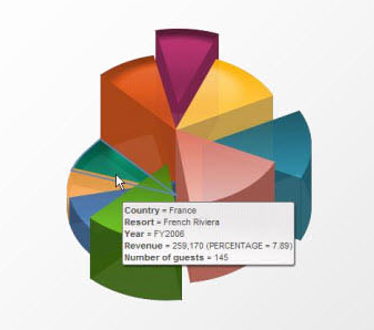
3D Exploding Pie Chart? Why?
It might seem like I’m piling on in singling out this example, but it’s by far one of the more ridiculous presentations of data that I have seen in recent memory. Tools will come and go and software vendors will continue to add the latest and greatest ways they think data should be displayed. However, the responsibility of effective data presentation rests squarely on the shoulders of the developers who are given the tools so we must resist the urge to use the latest gadgets and gizmos to present data just because they are new and the executives thought they were cool in the sales pitch. We must be vigilant in our efforts to explain and defend our choices for data visualization because ultimately it will be the developer, not the software company, that will be seen as a failure if the CEO’s “vision” is skewed because the data glasses he or she were given were the wrong prescription.
]]> Please visit the B-Eye Network for the full text.
]]>
Please visit the B-Eye Network for the full text.
]]>