Every Sunday Andy Cotgreave and Andy Kriebel present a data set and a visualization that has been published somewhere in the world. The data sets range from Peaches to Police Violence and anything and everything in between. The point of it all is to present the data in a new way; keep what works and change what doesn’t. The project has run since January 2016, and to date over 400 Tableau developers/fans/enthusiasts have submitted their takes on the data.
I only recently started participating despite watching it with great envy all year. Why did I start? A couple of reasons.
- The challenge – There are rules to the @MakeoverMonday project. The hardest one from me is the time box. Limiting myself to one hour is difficult because I like to explore data, and figure out what’s going to work best. This process can take a while depending on the data set, and considering I have zero familiarity with the data sets each week made it tougher.
- The learning – I’m trying to try new techniques and break out of “the easy and obvious” when and where I can with these challenges; it will only make me better
- Beauty in Simplicity – With only an hour to use, I can’t spend a lot of time on complexity, color palettes and the like. I have to do what works and disregard what doesn’t; Make it impactful and make it tell the story.
I’m posting my #MakeoverMonday offerings over at SonsOfHierarchies.com if you are interested. I’ve done the last two weeks, and I went back and found a couple of data sets to “catch up” on for practice. By posting them I’m hoping to see the evolution of my efforts, and if I learn anything cool along the way, I’ll be sure and add it on the blog post.
You can follow the #MakoverMonday action on Twitter or at the main website.
]]> One of my absolute favorite tools for selecting color pallets is Paletton. Paletton allows the user to start with a known base HEX value, or pick using the color wheel. With a click of an icon you can switch from Monochromatic, to Adjacent Colors, to a Triad, to a Tetrad. You also have the option to “Freestyle”.Once you have your base pallet, you can use their presets to run from light pastels to deep colors, as well as grey-tint pallets. You can then apply your pallet to a mocked up website, artwork, or animated images to see how they look “live”. You also have the option to run visual simulations for 13 vision deficiencies (color blindness). Finally, you can export your color pallet and insert it in to a custom color pallet within Tableau with very little effort.
 Another great tool, especially for maps pallets if ColorBrewer 2.0. ColorBrewer 2.0 applies pallets to a map from their pre-defined pallets. The have predefined pallets for single and multi-hue sequential use, divergent use and qualitative use. You can use the tool to take in to account color blindness, print friendly and photocopier safe color combinations. You can include and exclude roads (and adjust the colors of the roads), turn on and off the city marks and well as the boarders. This allows you to get a strong sense of how your map will look once the pallet is used within Tableau
Now once you have your colors selected, there is a super easy way to build you custom XML file. If you save the images, or take a screenshot, you can use it in Interwork’s Color Tool (one of their awesome Power Tools). Registration is free, and the tool is very easy to use. Below you can see I took a screen grab from Paletton and uploaded it to the Color Tool, and it instantly generates an XML file. The tool does take some liberties in adding additional pallets, but they are easily edited or removed.

I hope you find there resources useful in your color planning. Do you use other tools? Please share in the comments!
]]>Fast forward three years and what I saw was troubling.
First; there appears to be a huge drop off in attendance levels. At the key note addresses, TDWI use to fill the one of the largest of the conference rooms at Caesars. In comparison, over the span of the two keynote addresses this year TDWI barely filled a room that was a third of the size that it use to fill. The first key note was pretty flat in it’s content and didn’t really go anywhere. The second, presented by Russel Glass (LinkedIn), was great, but there was barely anyone in the room.
Second; every session I attended was sparsely populated, to the count of less then half full in most cases. Rooms were set for 40 -50 people in my sessions and the largest was 35. The draw to that one was Wayne Eckerson, and what he was talking about was a book he wrote 3 years ago.
Third; the sessions I attended were a bit dated, and basic. Maybe it was poor choices on my part, but this was my experience. Data Integration featured nothing new… ELT, Master Data Management, and Data Virtualization. The innovation sessions I attended were okay, but they need refined. They tried to cover a lot of content at a high level, but it needed to be a deeper dive on one or two methods. Most of us left feeling unfulfilled and the content got repetitive. Wayne Eckerson’s class was a discussion about the book he wrote three years ago. To prove the point of how dated that was, none of the people profiled in the book still worked in that role or that company any longer.
Lastly, the vendor situation was abysmal; 2 partners of TDWI were in attendance out of a possible 15. The vendors that are here are all just entering the market and trying to make a name for themselves. It’s great those small vendors are here, but without the major vendors and players there is a lack of excitement. When you have the major vendors skipping your conference it sends a very clear message that the relevancy for them was no longer present and there was no value in their attendance.
On a side note, TDWI tried to get people engaged via social media with a hashtag and twitter giveaway, but the population of tweets came from about 20 people where weren’t associated with TDWI or the vendors who were present. It’s worth noting that at a glance the average attendee at TDWI is over 45 (with a few exceptions) and active social media activity and engagement may be beyond the average attendee’s generation.
One of the major themes of the TDWI World Conference was “Innovation” and I’m thinking TDWI needs to put some innovation in to practice.
So how does TDWI, a subsidiary of 1105 Media, evolve to get data professional engaged again? How do they reengage the vendors to make them see the value in the conferences? How do they remain relevant in a rapidly changing landscape that is all about the data? There are more data professionals than ever before, both technical and business people alike, so how does TDWI tap in to that pumping vein of data passionate people?
TDWI was and is known for their educational content, but it seems to be a bit of “retread” now. Same instructors, with the same classes, with the same technologies. I realize that TDWI prides itself on being agnostic when it comes to vendors and platforms, but one possible solution would be providing vendor slanted walk-through or hands on sessions with these platforms. The trick with these would be to force the vendors to not sell the product, just walk use through use cases and teach us the ins and outs of the product. I liked the Short Sessions concept, but the instructors kept running over. They have to tighten up the content and stop on-time. The injection of some new blood in the instructor ranks wouldn’t hurt either. Let’s get some of the leaders in the industry TODAY in the rooms. Get the folks who are blazing the trail in Big Data, Cloud, Data Visualization and Predictive Analytics and have them build a curriculum around their successes and pitfalls.
The receptions and lunch formats needs to change. I think the “Sticker Grand Prix” needs to end. I realize it’s to encourage people to mingle with the vendors, but let’s face it; if people want to talk to vendors they will, if they don’t they won’t. The other problem was with so few vendors it was a lot of “hello again, give me a sticker” by the third vendor session. I did appreciate the lack of drink tickets in favor of an open bar. If the vendors and TDWI want to give things away, give them away; but you must be present to win. There needs to be more focus on the networking and social aspect of the receptions; that’s really what they are for… but people didn’t attend.
Perhaps on the night of the vendor reception the vendors should set up “hospitality rooms” and get people moving around like they did in previous years. Maybe some live entertainment to encourage people to attend the reception. In years past Microsoft set up a few Xbox 360’s with Kinect and people came in and played games and socialized.
Maybe it’s time to flip the script and TDWI should have a booth at vendor conferences and events to advertise and reach a new audience. But if they are going to make that investment, they need to be ready to meet the needs of the new data professionals, not the old guard still arguing Kimball vs Inmon.
With that said, the bottom line is people aren’t going to come back to a conference that isn’t evolving and valuable, regardless of age. In a day and age where budgets are tight an expensive conference that is showing me the same stuff I’ve seen previously isn’t a high value proposition.
I did share this feedback with TDWI shortly after the conference, but I wanted to share my thoughts publicly now that some time has passed.
]]>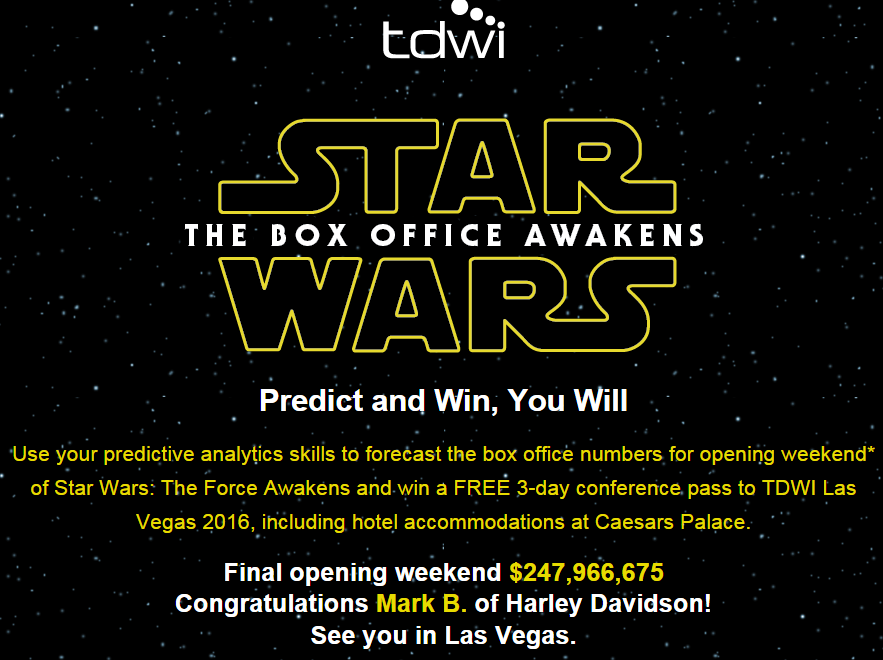
TDWI sponsored the contest, using analytics, to predict the opening weekend for Star Wars: The Force Awakens. HUGE, was not an acceptable answer, so I started to formulate how one would predict such a widely variable number. Here was my thought process, based on the data available and in the end, what I felt in my gut.
I first looked at the past openings for the Star Wars franchise; removing the special editions and re-releases, Using the number of theaters each movie opened in, and what the average ticket price was by year. I also approximated the number of tickets sold ( for an average theater size).
Looking at comparable films (i.e. “Blockbusters”) for this year, I estimated the number of theaters (about 4200) that SW:TFA would open in, and this year’s average ticket price (> $8.15 a seat).
This brought me to a figure of about $176M, which I felt really low. A small sample size of only 6 movies will do that…
Next, I looked at opening weekends for this year, with Jurassic Park being the largest at just over 200 million. No way Star Wars isn’t beating Jurassic park. No way. So where would the difference come in and make this opening remarkable, considering the Disney Machine of Marketing plastering ST:TFA on EVERYTHING.
The last tweaks in the numbers were guesses really.
- Cost different between standard and 3D; I guessed more 3D views would push the average ticket price up.
- Number of repeat viewers, guessing 40%, maybe higher depending on how good it was… but I went with 40%
- Social Influence, if it was good people telling their friend may push the box office $ up. This would be negligible at best
- Generational “Drag-Alongs” (Gen X and Gen Y, who are dragging their kids along for nostalgia). This would only be first views, not multiple in most cases.
- What did the franchise do in the past?
- What have competitors and others in the industry done recently?
- What marketing/awareness efforts are in place and how effective are they?
- What does the customer’s sphere of influence look like?
- What does brand strength do to the bottom line?
]]>

If you watched the Bills/Jets game on November 12th, you probably had a myriad of thoughts when first you turned on the game. In my house it was something to the effect of “even the NFL couldn’t wait to decorate for Christmas.”
My split-second later thought was “Wow, being colorblind would make this game really hard to watch.”
Turns out, I was right.

I’ve recently started a personal research project on color usage, design, and messages (which I will eventually share here). This example illustrates in a real-world setting the importance of color, and it’s usage. I’m sure Nike thought that those uniforms looked cool and the entire internet/social media universe would be talking about them all night and the next day… and they are, but the topic is different than expected.
Ever since I had a color-blind (albeit unknown to me) CFO ask me for a scorecard and I delivered a standard R/Y/G scorecard I have been hypersensitive to color usage for data visualization. Who would have thought it would have leaked in to a nationally televised NFL game?
]]>