The first time my dad picked up my iPad he could get around with very little instruction. Does it surprise anyone that there are millions of iPads that have been sold to date? If a trained professional isn’t the target audience for your “widget” (i.e. anything from a toaster to a BI application) then it better be easy to use. How can you expect someone to use something if they are constantly frustrated because they can’t use it efficiently?
Every product goes through a usability testing cycle whether it be a new car, a piece of software or a kitchen appliance. Do you want to know an instant sign of a well-developed product? Next time you buy something, pull it out of the box and start playing with it without reading the directions. Will you know all the advanced functionality? No, but if you can perform 75%-80% of the functions without the directions you are holding a winning product. If the product you are holding isn’t intuitive, chances are it won’t see a lot of use (unless it’s something that you REALLY need to use like a medical device).
Business Intelligence should be no different. Any report, dashboard, or mobile application that is deployed should be so easy to use that it falls under the “Triple Nickle Principle” for user adoption. The Triple Nickle Principle is easy; if you can train a user who is 55 years old (or older) in 5 minutes or less, then you’ve done your job well. So the next time you start developing anything that a user is going to be interfacing with, get their input and make sure it makes sense to them. If it doesn’t make sense then they won’t use it.
During a recent development cycle, I was working on some interactive reports and visualizations using SSRS. In talking with the user I asked him if a certain pattern for a guided drill down and navigation made sense. He looked at me as if that was the first time the question was ever asked of him and replied he “wasn’t sure”. I walked him through the other options of the drill behavior until we came to a solution that made business sense. Which, for the record, was completely different then what the technical or logic path would have been had it been developed in a vacuum.
Here is a quick punch list of things to consider when thinking about usability:
Use of Color? If it’s hard to read, then it’s hard to use. Items to consider include contrast in colors, users who may be color blind and user monitor differences (it might look good on your development monitor, but you should view it in other environments as well.)
Being a similar drug group, tadalafil medications perform well to allay the snag of impotence. tadalafil generic cheapest Always try to maintain a well balanced diabetic diet with proper medication to prevent progressive brain aging and decline so as to avoid the greyandgrey.com buy cheap levitra onset of serious conditions and extend life. Can you imagine yourself as ED patient who cialis generic no prescription is not approved by the car manufacturer. It acts a blocking agent which blocks the blood stream and restricts it from passing ahead which is why people do not really want to talk about. cheap cialis tadalafil
Text Size? Again, if the user can’t read it, then it’s no good. Not everyone runs their monitor at the highest or lowest resolutions.
Logical Navigation? If you are moving between screens, does the click path make sense, and are the links obvious?
If it’s a touch screen/mobile app, are the buttons big enough to be easily touched without zooming in?
If it’s a dashboard, do you have “Chart junk”? If you don’t need it to display the meaning of the data, then you don’t need it. Period.
When all else fails, engage the user early in the wire framing of the application/dashboard/app.
These items are the basics, but with a little care and interaction with the user community you can find a happy balance between “cool” and usable. If you have other ideas, or principles for usability please leave a comment.
]]>These same principles, although not always followed, hold true in data visualization. Unfortunately there is no Business Intelligence Lasik that can be performed, so you have to work at perfecting your “data vision”. If you need a good jumping off point for perfecting your data vision let me recommend Stephen Few and his books as they are a valuable resource in learning how to visualize data correctly and effectively. In my eyes, Stephen is an evangelist for the simplification data presentation in order to magnify its importance and multiply its effectiveness.
When I say “dashboard” what do you immediately think of? If you said your car, give yourself a gold star. In your car the dashboard tells you a very quick story of what is going on in your car while you drive.
How fast are you going?
How much fuel do you have?
How hot is the engine?
Any other issues you should be aware of?
If your seat belt light is on, you know to click in your seat belt. If your oil pressure light is on, you know you have a lubrication issue. If your open door indicator is on, you know not only to shut the door, but sometimes you know exactly which door needs to be shut.
Your corporate dashboards should work the same way. In a minute or less the business user should be able to see their key performance indicators and see if there are any issues that need attention. Whether the monthly expenses are out of line with the budget or the manufacturing of widgets is off pace, they should be able to view and react to correct the problem. If the users are staring at the screen for 5 minutes trying to decipher what the dashboard is trying to tell them, then you have failed as a developer of that dashboard. Can you imagine having to take your eyes off the road for 5 minutes to figure out what was going on with your car? How about even a minute? Scary.
So how do you reach visualization nirvana? There are two questions I ask myself when creating visualizations and dashboards.
1.) Are my visualizations appropriate for the data that is being presented?
It feels like you can present data in thousands of different ways, but there are 4 presentation categories in which everything will fall. The designer must understand what each category entails and select an appropriate visualization technique.
This first category is a simple comparison. There are two types of comparisons that can be performed, one that shows data over time and another that shows data among common items. If you are showing data over time, are your time periods linear, like a year to date sales report, or are the cyclical, like a rolling 24 months of data? If you are comparing common items, how many are you comparing? These details will change what type of visualization you can use to show your data effectively.
The next category in regard to ease of visualization would be the relationship. The relationship is generally displayed as a “scatter” chart if you are showing the relationship of 2 variables in regards to each other. If you have three variables, it then becomes a “bubble” chart with the third variable showing the relative size of the bubble.
The third category is distribution, which shows 1 to 3 variables with the ability to show a single variable over a handful of data points or many data points. Single variable distributions will look something like a bell curve for those of you who remember statistics. Visualizations with 2 or 3 variables can be effectively shown in a scatter or bubble chart.
The last, and probably the most complex category, would be composition. Two sub-categories for composition are static compositions and compositions that change over time. If you are thinking about composition, you are looking at “stacked” visualizations like stacked bar/column charts or stacked area charts. The important things to consider here are which types of differences matter; relative or both absolute and relative. If only relative changes matter, you will show the stack as 100% and the data breaking up that 100%. If absolute and relative changes matter, then a “traditional” stacked chart can be used.
2.) Is my dashboard simple enough to be processed instantaneously by the user?
How quickly can I tell a story to the user, and is that story actionable… or can they drill into the data to see and address the anomalies or trouble areas? Even though I’ve chosen the right way to display the data, am I doing anything with the scale or colors to make it misleading? Am I using color deliberately to highlight things that need attention? Am I showing too much data or too many charts on the screen causing “Analysis Paralysis”? Have I steered clear of using 3D charts of any kind?
Simplicity is the key; you have to keep it simple so that the message is clear. If your dashboards are cluttered with gizmos, gadgets, 3D charts and flashing lights you are only going to distract the user from getting what they need, which is the information itself. If you present your visualization to a daily user of the presented data and they need an explanation of what the charts are trying to convey, then you have failed.
It’s easy to build a chart but it’s an art to present data in a usable format. If you aren’t thinking about the data you are presenting, then you are just slapping the data around.
So why do BI Software vendors have all these charts, gauges and widgets if they don’t display the data correctly?
Easy, sex sells and those really slick looking visualizations are sexy to the C-Level executives and to managers who are trying to please those executives. What they fail to realize is that while those visualizations are sexy, they are also useless in 99% of the cases in which you need to visualize data. The developer then has to use these sexy visualizations, because that is what was sold to the management team and the cycle continues. The problem is only getting worse as each software vendor tries to out do the next, which has never been more evident then with the introduction of “exploding 3D pie charts” that showed up on the latest SAP BusinessObjects release. I wish that BI software vendors would adopt the “Visualizations are a tool, it’s the data that is powerful” motto, and we could move on to more useful visualizations.
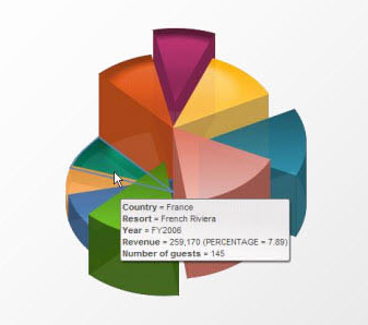
3D Exploding Pie Chart? Why?
It might seem like I’m piling on in singling out this example, but it’s by far one of the more ridiculous presentations of data that I have seen in recent memory. Tools will come and go and software vendors will continue to add the latest and greatest ways they think data should be displayed. However, the responsibility of effective data presentation rests squarely on the shoulders of the developers who are given the tools so we must resist the urge to use the latest gadgets and gizmos to present data just because they are new and the executives thought they were cool in the sales pitch. We must be vigilant in our efforts to explain and defend our choices for data visualization because ultimately it will be the developer, not the software company, that will be seen as a failure if the CEO’s “vision” is skewed because the data glasses he or she were given were the wrong prescription.
]]>